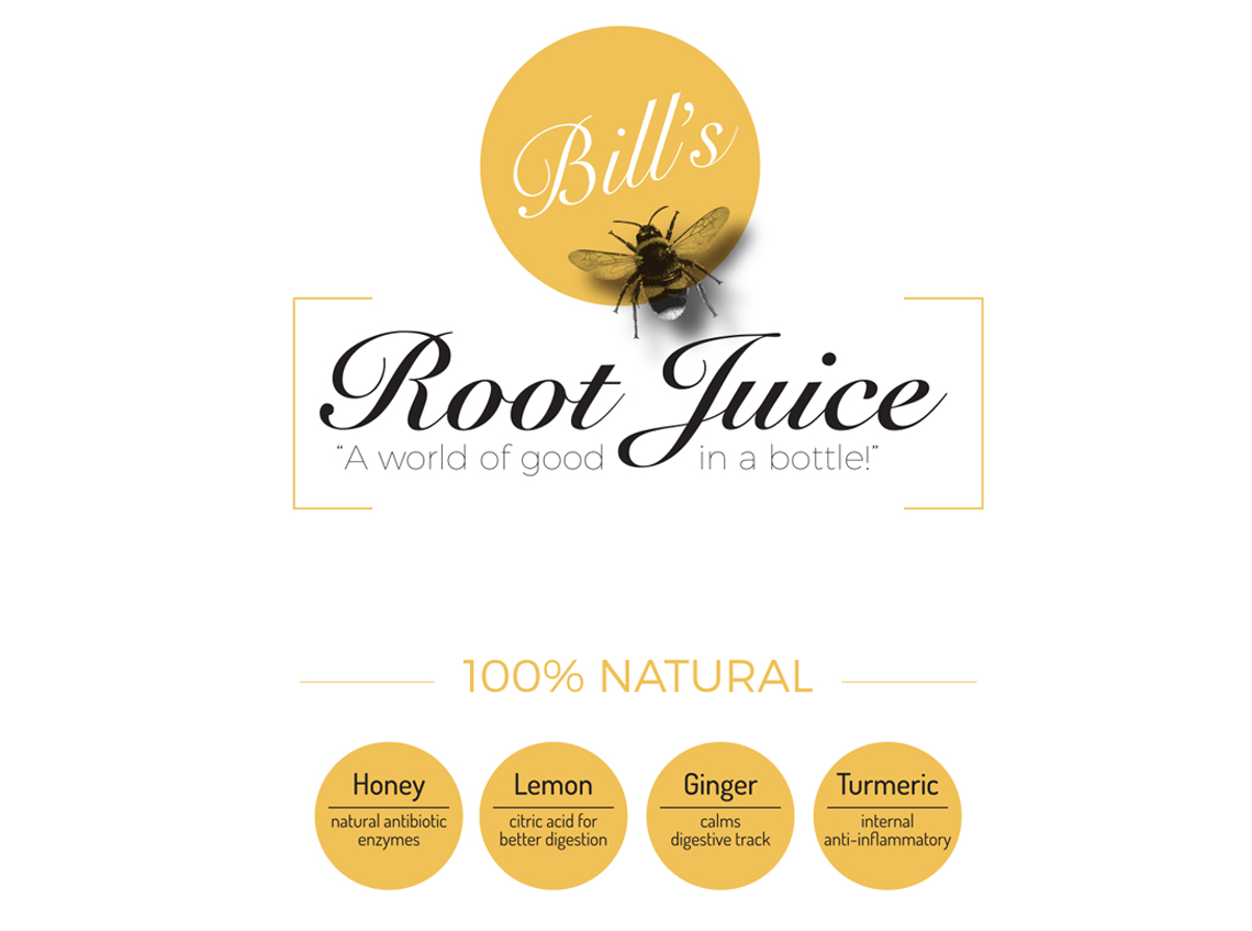
Posted at 19:44h
in
by btridico
We're not only graphic designers, but consumers of this excellent product. Bill, the owner, developed an amazing recipe of nutrition in a juice. This all natural product conjured up a simplistic, clean organic look to match it's product foundation. Consideration for long term growth has...
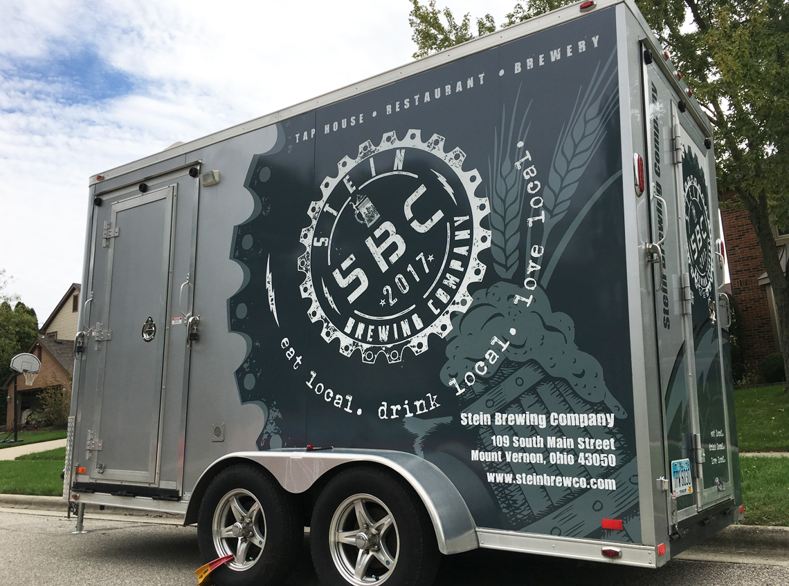
Posted at 14:31h
in
by btridico
The SBC Brewing Company out of Mt. Vernon, are taking their product to the streets. Dave Stein, owner, had forward thinking from the beginning. He customized a beautiful interior point of sales trailer, now needed the exterior to fall into his branding. We try to...
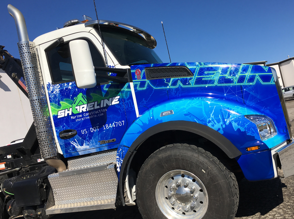
Posted at 22:43h
in
by btridico
From logo design, to texture illustration, to wrap design, print and installation, this was a very exciting wrap piece for us to showcase. Most notably our efforts are a pure joy when working with wonderful clients as the Shoreline family....
Posted at 20:34h
in
by btridico
Run4Kids is a national fundraising opportunity put on in local communities and locally marketed. We worked with the local chapter to develop basic shapes and subjects using vivid color that would be easily recognizable throughout the branding process....
Posted at 19:59h
in
by btridico
The Hog was a product logo for one of many in the line provided by Whiteside Manufacturing, a proud Ohio based producer of automotive products. Illustration and basic decor was the flavor of the day while intentionally displaying a fun, memorable image for this product....
Posted at 19:27h
in
by btridico
The FIRST Ford dealer in Ohio, est. 1913, just got an update. Intensive research and development into their current logo design was the request by the current owner and 4th generation, Joe Chapman. Several logos over a period of time were studied and reworked until...
Posted at 19:08h
in
by btridico
The FIRST Ford dealer in Ohio, est. 1913, just got an update. Intensive research and development into their current logo design was the request by the current owner and 4th generation, Joe Chapman. Several logos over a period of time were studied and reworked until...
Posted at 18:49h
in
by btridico
This family-owned, rapidly growing, Ohio based company requested a basic logo that symbolizes their expertise. Once landing on a clean logo, it's application on their equipment embraces more of a flashy impression, a departure from the simplicity of their logo....
Posted at 18:14h
in
by btridico
A throwback to a more simple time, this 50's diner serves up an authentic experience, starting with their logo. We worked intensively with the owner, David Stein, to create not just a logo for a location, but an image for an experience with a target...
Posted at 18:10h
in
by btridico
As a leader in their industry, Ricart Automotive required a logo to push their internet presence. This is a combination of their old vs. new marketing approach. The established Ricart font developed into a button representing their .com marketing efforts. Upon request, brighter colors were used for...